CSS Flexbox Tutorial: Master Modern Layouts with Grid
This CSS flexbox tutorial teaches modern layout techniques with Flexbox container properties, CSS Grid, template areas, alignment, and responsive patterns.
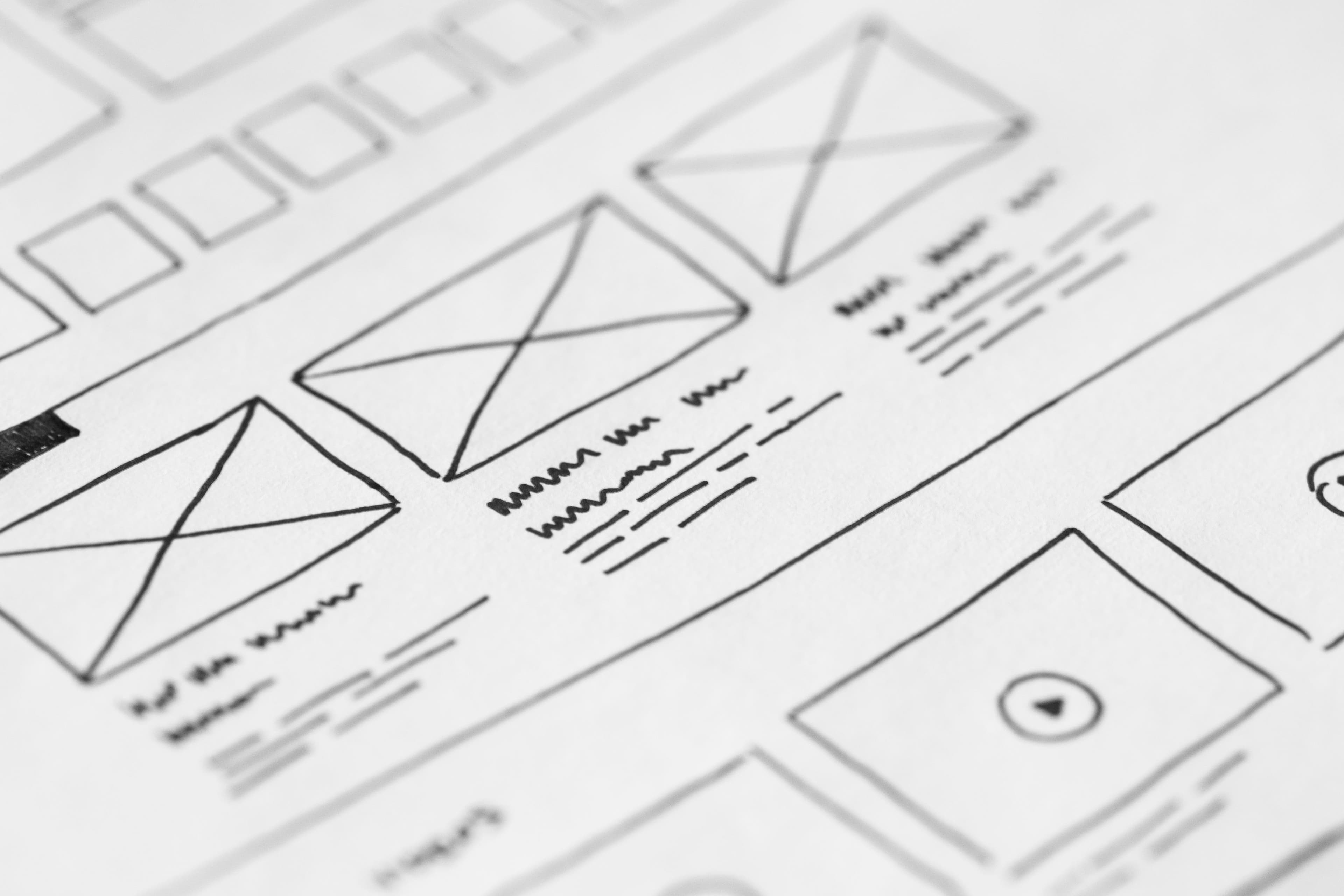
CSS Flexbox Tutorial: Master Modern Layouts with Grid
Building layouts in CSS used to mean floats, clearfixes, and endless frustration. This CSS Flexbox tutorial changes that completely. Together with CSS Grid, Flexbox gives you a powerful, intuitive toolkit for building responsive, complex layouts with far less code and far fewer hacks. By the end of this guide you will understand when and how to use each system, and you will never go back to floats.
Modern CSS layout is built on two pillars: Flexbox for one-dimensional alignment and Grid for two-dimensional structure. They are not competitors but complements. The best layouts often combine both, using Grid for the overall page structure and Flexbox for aligning content within each section. This tutorial covers both systems with practical code examples.
Why Flexbox and Grid?
Before Flexbox and Grid, developers relied on floats, tables, and inline-block hacks to create layouts. These approaches were fragile, required clearfix hacks to contain floated elements, and made vertical centering surprisingly difficult. Responsive design was painful because floats did not adapt naturally to different screen sizes.
Flexbox (introduced in CSS3) solved one-dimensional layouts — aligning items in a row or column with proper distribution of space. CSS Grid went further, solving two-dimensional layouts where you control both rows and columns simultaneously, which is something floats could never do cleanly.
When you study a CSS Flexbox tutorial, the key insight to remember is this: Flexbox is for one dimension (either a row or a column), while Grid is for two dimensions (rows and columns at the same time). Once you internalize this distinction, choosing the right tool becomes second nature.
Flexbox Fundamentals: The Core of This CSS Flexbox Tutorial
To use Flexbox, set display: flex on a container element. Its direct children automatically become flex items:
.container {
  display: flex;
}
By default, flex items line up in a row and stretch to fill the cross axis. The two axes matter in every Flexbox discussion, so memorize them:
- Main axis: The direction items flow, controlled by
flex-direction. In a row layout, this is horizontal. In a column layout, this is vertical. - Cross axis: Perpendicular to the main axis, where
align-itemsoperates. In a row layout, this is vertical. In a column layout, this is horizontal.
Understanding these axes is the foundation of every Flexbox property. When you change flex-direction, the main and cross axes swap, which also swaps the behavior of justify-content and align-items.
Flex Container Properties
These properties go on the parent element (the flex container) and control how its children are arranged:
.container {
  display: flex;
  flex-direction: row;            /* row | row-reverse | column | column-reverse */
  justify-content: space-between; /* aligns items on the main axis */
  align-items: center;            /* aligns items on the cross axis */
  flex-wrap: wrap;                /* allow items to wrap to new lines */
  gap: 16px;                      /* spacing between items */
}
flex-directionsets the main axis:row(left to right),column(top to bottom), or their reverses which flip the order.justify-contentdistributes space along the main axis. Values includeflex-start,center,space-between,space-around, andspace-evenly. Each distributes extra space differently:space-betweenputs all gaps between items,space-aroundadds half-gaps at the edges, andspace-evenlydistributes space equally including the edges.align-itemsaligns items along the cross axis:stretch(default, fills the container),flex-start,center,flex-end,baseline(aligns by text baseline).flex-wraplets items wrap onto new lines instead of shrinking indefinitely to fit one line. Set it towrapfor responsive behavior.gapsets the spacing between flex items without needing margins on individual items. It is cleaner than adding margins because it only applies between items, not at the edges.
Flex Item Properties
These properties go on the children (flex items) and control their individual behavior:
.item {
  flex-grow: 1;         /* how much the item grows relative to siblings */
  flex-shrink: 1;       /* how much it shrinks when space is tight */
  flex-basis: 200px;    /* initial size before growing or shrinking */
  order: 2;             /* change visual order without changing DOM order */
  align-self: flex-end;  /* override align-items for this one item */
}
The shorthand flex: 1 sets flex-grow: 1; flex-shrink: 1; flex-basis: 0%. The three values work together: flex-basis is the starting size, flex-grow controls how extra space is distributed among items, and flex-shrink controls how the item contracts when there is not enough room. Understanding this interplay is essential for building flexible, responsive components.
CSS Grid Basics
Switch to a two-dimensional layout with display: grid:
.grid {
  display: grid;
  grid-template-columns: 1fr 2fr 1fr;
  grid-template-rows: 100px auto;
  gap: 20px;
}
The fr unit represents a fraction of the available space. 1fr 2fr 1fr creates three columns where the middle one is twice as wide as the others. Use repeat() to avoid repetition when you have many columns:
.grid {
  grid-template-columns: repeat(3, 1fr);
}
For responsive grids without media queries, combine repeat() with minmax() and auto-fit:
.grid {
  display: grid;
  grid-template-columns: repeat(auto-fit, minmax(250px, 1fr));
  gap: 20px;
}
This automatically creates as many 250px-minimum columns as fit in the container, then stretches them to fill the row. It is one of the most powerful patterns in modern CSS because it creates fully responsive layouts with a single line. The minmax() function ensures each column is at least 250px but can grow larger, and auto-fit collapses empty tracks so the items stretch to fill the available space. Switch to auto-fill and empty tracks are preserved instead, which produces a different layout when you have fewer items than tracks.
Grid Template Areas
Grid template areas let you name grid regions and place items visually — perfect for full page layouts where readability matters:
.layout {
  display: grid;
  grid-template-areas:
    "header header header"
    "sidebar main main"
    "footer footer footer";
  grid-template-columns: 200px 1fr 1fr;
  grid-template-rows: auto 1fr auto;
  min-height: 100vh;
}

.header  { grid-area: header; }
.sidebar { grid-area: sidebar; }
.main    { grid-area: main; }
.footer  { grid-area: footer; }
Each item uses grid-area to claim a named region. This is far more readable than counting column and row numbers, and changing the layout is as simple as rearranging the area names. You can also place items explicitly with grid-column and grid-row:
.featured {
  grid-column: 1 / 4;   /* span columns 1 through 3 */
  grid-row: 1 / 2;       /* occupy row 1 */
}
When to Use Flexbox vs Grid
This CSS Flexbox tutorial would not be complete without answering the most common question developers ask: which one should you use?
- Use Flexbox for one-dimensional layouts: navigation bars, toolbars, card rows, button groups, centering content. If you are distributing items along a single axis, Flexbox is the right tool and simpler to reason about.
- Use Grid for two-dimensional layouts: full page layouts, photo galleries, dashboards, forms with aligned labels and inputs. If you need to control both rows and columns at the same time, reach for Grid.
- Combine them. A common and effective pattern: Grid for the page layout, Flexbox inside each region for component-level alignment.
Grid also gives you align-content (distribute rows in the grid container when there is extra space) and justify-items (align items within their grid area along the inline axis) — properties that Flexbox does not offer in the same way.
Common Mistakes
Even after a thorough CSS Flexbox tutorial, developers hit a few common pitfalls:
- Confusing the axes.
justify-contentalways follows the main axis;align-itemsalways follows the cross axis. Whenflex-directioniscolumn, they swap roles, which trips up many beginners. - Forgetting flex-wrap. Without it, items shrink to fit one line, which can cause overflow or squished content that is unreadable.
- Using flex: 1 everywhere. Understand what
flex-basisdoes before relying on the shorthand, because it can produce unexpected sizing. - Ignoring min-width. Flex items can shrink below their content size. Set
min-width: 0to allow proper text truncation. - Overusing order. Reordering with
orderchanges visual order but not DOM order, which hurts accessibility and keyboard tab navigation. - Mixing auto-fit and auto-fill blindly. They behave differently when the number of items is less than the number of tracks, producing noticeably different layouts.
Flexbox and Grid are the modern foundation of CSS layout. This CSS Flexbox tutorial covered the essentials, but practice makes perfect. Build a navigation bar with Flexbox and a full page template with Grid template areas. Once these concepts click, you will never go back to floats. Ready to prove your skills? Take the quiz below to test your knowledge of Flexbox properties, Grid, alignment, and responsive patterns.
Ready to test your knowledge?
Take the CSS Flexbox & Grid Quiz — score 70% or higher to earn a free certificate.
Related articles
 Web Development
HTML CSS for Beginners: Build Your First Web Page
Learn html css for beginners with this guide covering tags, structure, selectors, the box model, responsive design, and best practices to build your first page.
 Web Development
JavaScript Basics Tutorial: A Complete Beginner Guide
Start coding for the web with this javascript basics tutorial covering variables, data types, functions, DOM manipulation, events, and common mistakes.